-
Author
-
January 8, 2019 at 18:56 #216190
LeonGeb
ParticipantIn many situations the website would benefit from a wider content area. In the themesettings i can only choose the arrangements but not the size of the content area. or did I miss this setting?
January 8, 2019 at 19:19 #216193Kieran_SQ
ModeratorHi,
There isn’t an option to override the width of the content per page but you can use the below CSS in conjunction with your pages ID to target a specific page.
COPY CODE@media only screen and (min-width: 768px) { .page-id-6 .row { width: 1080px; } }In the above example I have used the page with the ID of 6, your activity page, and set the width to 1080px. Change these two values to suit your needs. You can get the page ID via the backend or visiting the page on the front end, viewing the browser console (F12) and checking the class added to the body tag (see screenshot).
Thanks,
Kieran
Hi there!!! Help others from the community and mark any reply as solution if it solved your question. Mark as a solutionJanuary 11, 2019 at 23:14 #216398ParticipantHi Kieran,
Thank you for this. Will you consider to add this option in a future update? To have to target different pages with specific css will be quite some work in the future (or now already 🙂 )
Best regards,
Leonido
January 12, 2019 at 10:42 #216411ModeratorHi Leonido,
It’s certainly a good idea, I’ll pass this on to the developers as a potential option to be added in a future release.
Thanks,
Kieran
Hi there!!! Help others from the community and mark any reply as solution if it solved your question. Mark as a solutionJanuary 12, 2019 at 19:39 #216461ParticipantHi Kieran,
i tried your css but the result is not very good. The profil picture as well as the search text is extended.
January 13, 2019 at 11:05 #216476ModeratorHi,
When I access your site I do not see that issue. If you have removed the CSS from your SweetDate Child theme then please add it again, at the end of the file, and let me know when you have so I can check.
Thanks,
Kieran
Hi there!!! Help others from the community and mark any reply as solution if it solved your question. Mark as a solutionJanuary 13, 2019 at 17:31 #216505ParticipantHi Kieran,
I put the css code back into that specific page again. its the profile page with id=0
COPY CODE/* set width for specific pages */ @media only screen and (min-width: 768px) { .page-id-0 .row { width: 1080px; } }Best regards,
LeonidoJanuary 13, 2019 at 17:57 #216507ModeratorHi,
Please try the below CSS instead of the prior CSS.
COPY CODE/* set width for specific pages */ @media only screen and (min-width: 768px) { .page-id-0 #main.row:nth-child(1) { width: 1080px; } }Kieran
Hi there!!! Help others from the community and mark any reply as solution if it solved your question. Mark as a solutionJanuary 13, 2019 at 18:41 #216514ParticipantIt still shows the same issue with bigger image and to wide search field.
January 13, 2019 at 18:48 #216518ModeratorHi,
I’ll refer this to one of our developers for insight. Please remove both CSS snippets and await a response. Thank you for your patience.
Kieran
Hi there!!! Help others from the community and mark any reply as solution if it solved your question. Mark as a solutionJanuary 13, 2019 at 19:04 #216525ParticipantHi Kieran,
I removed the snippets per your request.
Best regards,
LeonidoJanuary 15, 2019 at 15:35 #216606Radu
ModeratorWith the next css you will have 50/50 avatar zone and the fields and also the avatar streched into available space with the last css line
COPY CODE#profile .five.columns {width:50%} #profile .seven.columns {width:50%;} #profile div#item-header-avatar.eight { width: 100%;}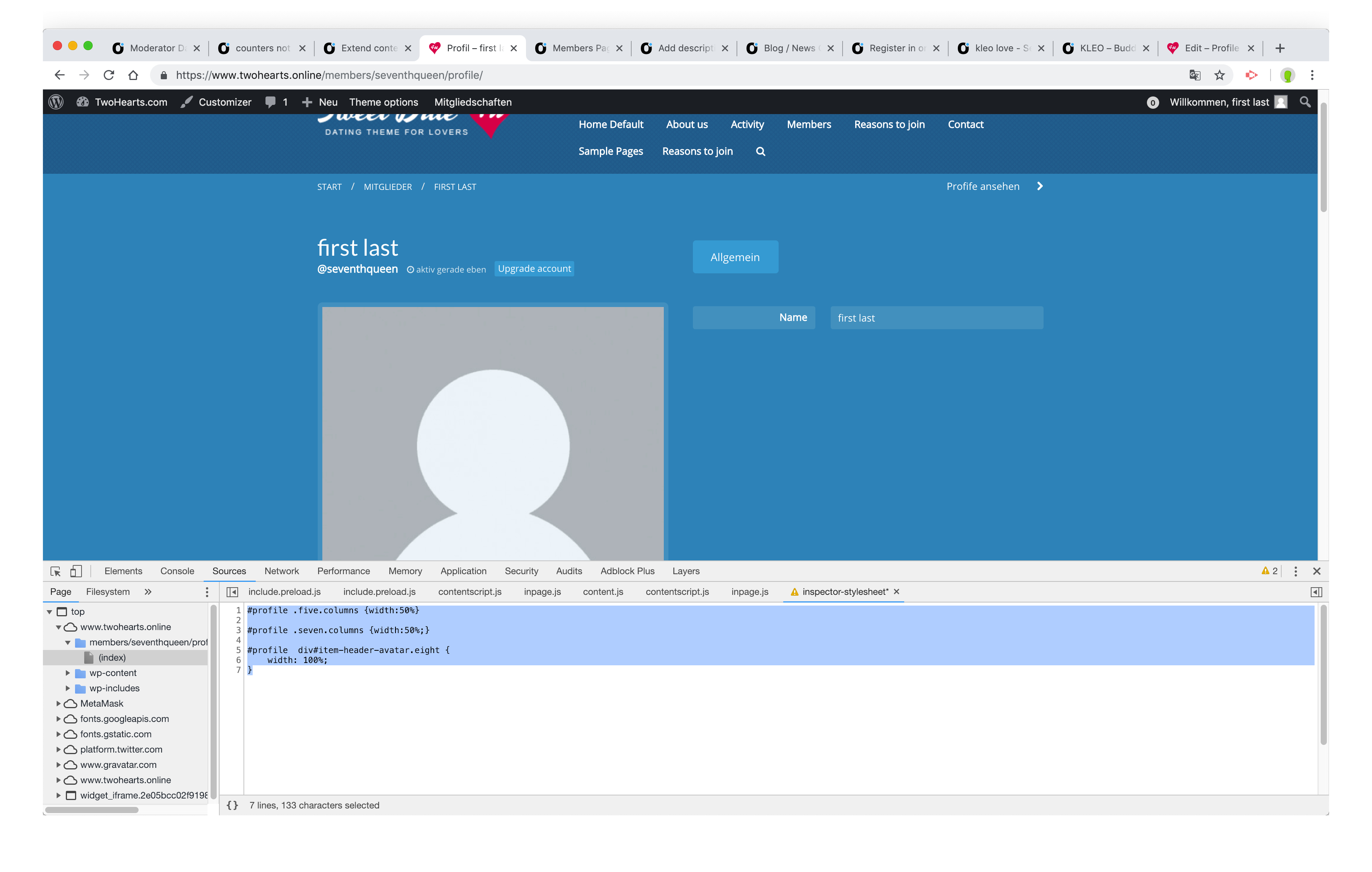
Cheers
RHi there!!! Help others from the community and mark any reply as solution if it solved your question. Mark as a solutionJanuary 15, 2019 at 19:31 #216629ParticipantDear Radu,
I tried
COPY CODE#profile .five.columns {width:50%} #profile .seven.columns {width:50%;} #profile div#item-header-avatar.eight { width: 100%;}alone and also including the previous css
COPY CODE/* set width for specific pages */ @media only screen and (min-width: 768px) { .page-id-0 #main.row:nth-child(1) { width: 1080px; } }I still get the same results.
Please let me explain what the goal is:
I am trying to make the content area wider, where profile, notifications, messages etc are listed. below the header where the profile picture is. So the menu items (user-xprofile, user-notifitcations etc) are listed in one line and not in 2 lines as the image attached shows
Now when I use the second css (the one with the page-id-0) it displays the header correctly but the content area below did not change to 1080px.
In one of my previous posts I was able to apparently put all in one line but the search bar on the right side was extremely wide so it kinda covered the last items.
I hope I was able to understandably explain this.
Best regards,
LeonidoJanuary 17, 2019 at 12:19 #216728ModeratorHi,
Check those
Or you can divide the 980px space using this
COPY CODEdiv#main-content.eight.columns { width: 77%; } aside.four.columns { width: 23% !important; }Or you can increase the wrapper to 1080
COPY CODEdiv#main > .row { width: 1080px; }All snippets seems to take action tested

Cheers
RHi there!!! Help others from the community and mark any reply as solution if it solved your question. Mark as a solutionJanuary 17, 2019 at 12:36 #216733ParticipantHi Radu,
Thank you that worked out.
best regards,
LeonidoJanuary 17, 2019 at 18:17 #216761ModeratorGreat
Cheers
RHi there!!! Help others from the community and mark any reply as solution if it solved your question. Mark as a solution -
AuthorPosts
You must be logged in to reply to this topic.