-
Author
-
November 29, 2018 at 14:57 #214406
clarnastic
ParticipantHello dear help service,
There are grey lines under each element in the footer. How can I get rid of them? It really doesn’t look nice. You can see a screenshot attached.
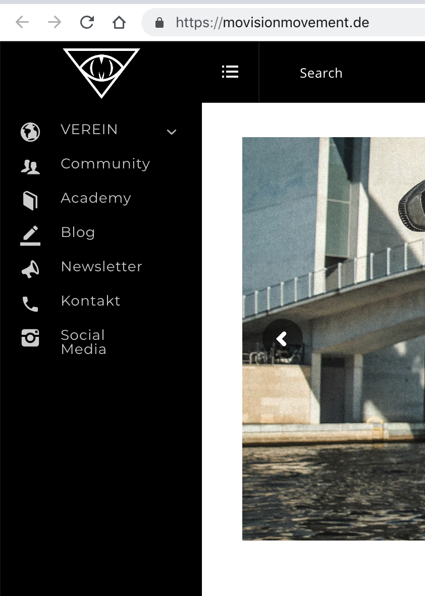
Another issue is how our logo looks. We tried several pictures, but it never looks good. Do you have any idea, how to improve it?
The third and last question is: Is it possible to make a page that is only visible to users who are not logged in, but users who are logged in already see the dashboard? I tried different things but it ended up in too many redirects.
Thanks!
November 29, 2018 at 18:15 #214438Radu
ModeratorHi,
The logo placeholder was dor a landscape type of a logo, for this it needs a small adjustment , the only reliable way it’s ti make it larger and to center it, the logo you can to the next,

Add the next css to wp-admin -> theme options -> quick css
COPY CODE.sidemenu-header .logo img { max-height: 50px; margin: 0 auto !important; text-align: center; } .sidemenu-header a.real-logo.standard-logo { text-align: center; }For the border of the footer lists, use the next css to de-activate it.
COPY CODE#footer .widget { border-bottom: 0 !important; }Cheers
RHi there!!! Help others from the community and mark any reply as solution if it solved your question. Mark as a solutionNovember 29, 2018 at 21:11 #214454clarnastic
ParticipantHow can I improve the resolution when the sidebar is disabled? the mini logo also doesn’t look good on our page.
November 30, 2018 at 19:04 #214528Radu
ModeratorHi,
Add also this css and check
COPY CODE.logo a.mini-logo img { width: 40px; }Cheers
RHi there!!! Help others from the community and mark any reply as solution if it solved your question. Mark as a solution -
AuthorPosts
The forum ‘Bugs & Issues’ is closed to new topics and replies.
